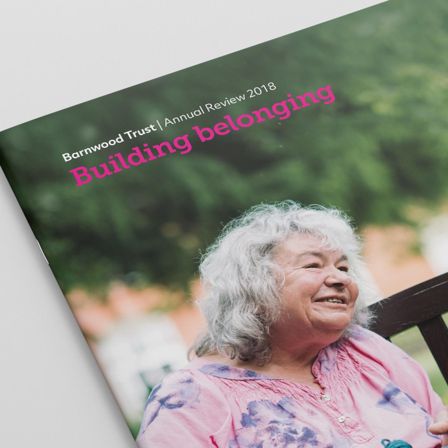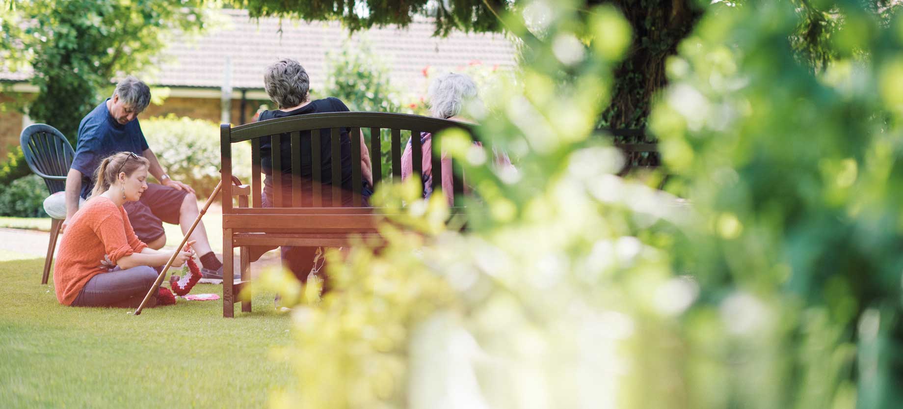
Building belonging
Words fail us.
Barnwood Trust is the go-to place for people with disabilities and mental health problems in Gloucestershire. They’re wonderful at what they do. But they were struggling to express exactly what that was.
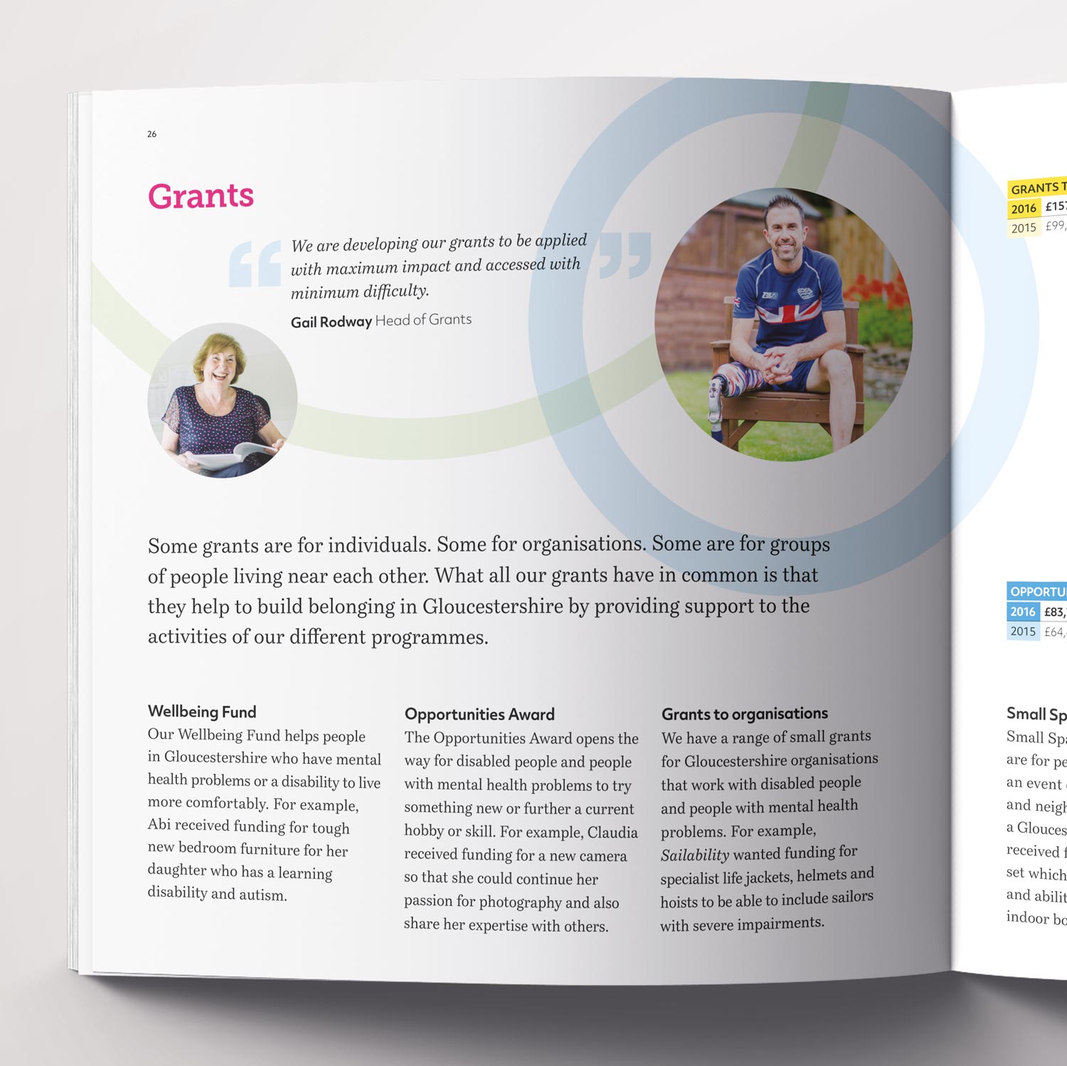
It’s easy to see why. Unlike most charities, Barnwood generally don’t fund activities and their services are complex. They shape housing projects and unearth opportunities, as well as encouraging community initiatives and giving small grants. Wrapping all this up in memorable messaging and design had been escaping them.
Building belonging.
With brand design agency Brother, I helped Barnwood distill their different service strands into the line: “Building belonging.” This came out of our conversations with the Board, beneficiaries and employees. It become clear that creating a sense of community is at the heart of everything Barnwood does.
At the same time, Brother developed a ripple theme that united the visual identity. This captured Barnwood’s power as a catalyst of community change. They’re often facilitators, providing connections, advice and encouragement rather than direct management.
A bold new direction.
Barnwood were quick to get behind the new positioning and messaging. They immediately began to use our narratives to set out their stall for partners and candidates. Plus we adapted these to develop story-led annual review copy. “Building belonging” now badges everything from the charity’s website to their community vehicles.